To understand it better, it is necessary to educate yourself on responsive design fundamentals and key concepts. So, first and foremost, let’s learn how responsive web design works.
What is Responsive Web Design, and how does it work?
The concept behind responsive web design is to create a flexible website with information and design that behaves like water filling a container or a device that customers use to access the website. To feel at ease inside the screen, all aspects of the website are altered. If required, they shrink to fit precisely into smaller areas or, on the other hand, they extend to fill every inch of available space. Everything adjusts to the device’s size automatically.
The most important aspect of a responsive website is to recognize that its primary goal is to create a pleasant user experience for everyone. This necessitates providing decent reading, a pleasing aesthetic experience, a particular level of accessibility, and consistent functioning across devices.
In reality, responsive web design uses CSS and, in some cases, JavaScript plugins to adapt to screen size, orientation, resolution, color capabilities, and other device attributes. For example, the viewport and media queries are two of the most common CSS properties for responsive web design.
Responsive Web Design’s key features
Ethan Marcotte coined the term “responsive design” in 2010, and it indicated three essential qualities that are now regarded as the concept’s significant foundations. They are as follows:
- Flexible layout;
- Flexible images;
- Media queries;
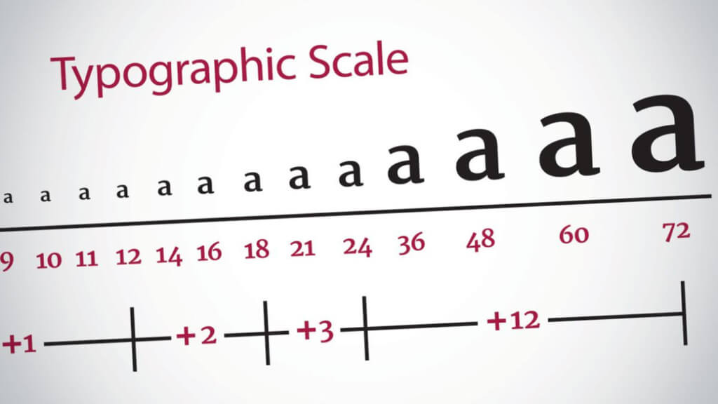
One more essential feature is responsive typography because the content is king and should be treated as such.
You are mistaken if you believe you can live without one or more features. It could work in some situations, but without this quartet, you wouldn’t be able to give universal access in any case. That is precisely why responsive web design is so important.
Remember that not only must you handle multiple screen sizes, but you must also consider device orientation since consumers like moving from portrait to landscape orientation in an instant. It’s at this point that the versatility of all details comes in useful. Each one has a critical function to play in providing information to your users.
As a result, these four elements are required to ensure that your website is fully responsive. Let us look at them to understand better their responsibilities, why they are so important, and how to bring them to life.
Flexible layout
The design’s heart and soul is a flexible layout. It’s usually a flexible grid with relative measurement units like percentages or em’s rather than absolute measurements like pixels or points.
It’s crucial to grasp the philosophy behind a flexible grid, which argues that instead of supporting all different-sized devices, you should add a breakpoint when the content starts to appear terrible.
There are two broad approaches to this.
Last decade, Ethan Marcotte recommended using one of the heritage layout techniques that had become more popular. The basic idea was to scale the grid components up or down using a simple mathematical formula: target size/context = relative size. The mechanics of layout sizes and spacing are based on this formula. It’s applied to all child components in your grid, putting all page elements in relative units that change as events unfold. While this approach was very dependable and time-tested, it did have certain flaws.
As a result, today’s developers choose current technologies like multiple-column layout, Flexbox, and Grid, which provide more polished, beautiful, and clean solutions. While the first option necessitates considerable code, the latter two will automatically reduce and distribute space between objects, providing you with precise, hassle-free tools to construct adaptable layouts.
Finally, but certainly not least.
To align information properly, remember to sort, reorder, and nest rows and columns.
To put this into effect, you may utilize grid systems that already include a fluid grid, such as Bootstrap, or you can specify your specifications for columns, spacing, and containers. The latter option has become preferable since the invention of Flexbox because it gives you freedom, assists in the creation of a lightweight skeleton, keeps your code clean, and saves you from messing with other premade solutions that can be difficult to adapt to your own needs due to the restrictive use of CSS classes and styles that are difficult to superimpose.
Flexible images

Since the beginning, images have been a roadblock to creating genuinely flexible responsive websites. The problem is that the project’s flexible grid forced us to sacrifice our cherished pixels in favor of relative units of measurement. This indicates that all of the grid’s elements should follow suit. Images are no different. They should also follow this concept because they play an essential role in visual communication and user experience.
This, however, is not a simple task. Images (pictures, drawings, and other graphical components) should be adaptable to play along. Instead of overflowing a flexible grid, container, or column, they should move and scale with it. Furthermore, they should keep their clarity and quality. As a result, this is a difficult nut to crack. There is, however, a way out.
Let us look at some of the ways that developers have developed over the last decade to resize photos proportionally or present images that exactly fit the screen without losing quality.
Having several versions of the same image
The first technique entails uploading several picture copies to the server. The most straightforward, simplest, and oldest method of dealing with this problem; regrettably, it is not the most efficient; still, it works.
The basic idea of this method is that you must upload several copies of the same picture and deliver the appropriate-sized version dynamically based on the user agent. Overload is, of course, the method’s major problem. Modern websites have a lot of graphic content. On websites, there are hundreds of photos, and this number is growing at an exponential rate. Although this method served the community well in the past, it may now be utilized in local projects or in conjunction with other current ways to optimize pictures and use as few as possible.
CSS’s Max-width property
Ethan Marcotte proposed the second technique, which was well-received by the community in the early 2010s. It makes the most of CSS’s max-width property. The idea is that you send images at their maximum size and then allow the browser to decide on their relative sizes based on the CSS guide.
There are two critical points to remember while using this method. To begin with, some browser versions, notably the infamous Internet Explorer, do not support this CSS feature. However, Internet Explorer is slowly but steadily declining throughout the world; as a result, you may not need to be concerned about this issue very soon.
The second major issue is download times, which is a far more significant issue than the first. It may take longer to adjust to smaller screens if the original picture size is enormous because it was designed for large devices from the start. As a result, it might cause the website to slow down substantially and decrease overall performance, resulting in a more significant bounce rate.
Despite these two crucial drawbacks, this method is a common choice that is quite dependable.
Responsive images
The third technique is imitating responsive graphics. This technology has been around for a long time. As a result, there are various options for implementation:
- Using the srcset property, you can pick the right web-optimized photo from the collection and present it to the client based on the viewport size or screen density.
- You may pick the same picture with a different cut and focus on the image’s significant section by capitalizing on the <picture> attribute, depending on the screen’s device CSS width.
- Use the image() function, which allows for various image cropping depending on the CSS viewport width.
SVG
The fourth technique entails the use of SVG. Although it does not work for photography, it significantly impacts the visuals, such as drawings, icons, and logotypes.
Each approach has advantages and disadvantages. Likewise, each has its own set of drawbacks and implementation challenges. As a result, depending on the job you need to complete, you may discover that you profit from one or the other. Furthermore, you may find yourself in situations when the easiest way to deal with graphics is to turn them off entirely and concentrate solely on the information – believe it or not, this is also a valid option.
One vital aspect to keep in mind when it comes to image flexibility is finding a means to adapt gracefully to new screen sizes while maintaining image quality. That can be a difficult task at times. However, to avoid jeopardizing page performance, load time, and website weight, you must balance maintaining quality and lowering file size.
Furthermore, you must take into account the distinction between CSS Resolution and Screen Resolution. It can be found on all mobile devices, as well as specific desktop computers. The issue is that to display crisp photos to people with high-resolution screens, you must submit a retina-ready image, which is an image that is several times bigger than the ordinary one. This may significantly slow down the process. When you combine this with a sluggish mobile internet connection, you may find yourself dissatisfied and perplexed user waiting for your image to load. As a result, while deciding on a strategy for producing flexible pictures, examine all essential factors. Play with caution.
Media queries
Media queries are the third essential component of a responsive website. By adjusting your entire design or sections to suit the screen size better, media queries allow you to create several layouts inside one project. Using simple CSS, you may rearrange and reorganize existing components like columns, rows, and containers. In addition, they give multiple responsive tiers with various distinct designs based on the user agent’s characteristics, such as the browser window’s size, orientation (landscape or portrait), screen resolution, etc.
The best part is that by combining several media queries, you can construct multiple style sheets and make fundamental layout modifications to match various widths. They can also be combined into a single style sheet.
When using media queries, it’s usual to show a multicolumn layout for large screens and gradually lower the number of columns to accommodate smaller devices. Finally, the website should feature one column and slide-out navigation on mobile devices.
One thing to keep in mind. Even though browsers generally support media queries, specific older versions do not. To solve this problem, you may utilize the JavaScript library (css3-mediaqueries.js), which aids in support of this functionality in these browsers.
Responsive typography

Although current websites are visually beautiful, web design is still all about shaping textual content. Content reigns supreme. No one could disagree with it. As a result, typography is becoming increasingly essential as a primary instrument for serving it.
When the mobile web was first introduced in the early 2010s, no one thought about making typography responsive because everyone was focused on mastering fluid grids and pictures. It is now, in the early 2020s, a critical piece of the giant jigsaw.
Indeed, suppose you want a completely responsive website that fulfills all of the market’s current demands and needs. In that case, scalable, fluid typography across numerous breakpoints and preset font sizes is a must. It just belongs here, no questions asked. Moreover, it guarantees that material is readable and appealing on all platforms and improves accessibility by presenting information to all reader groups.
There is, however, a catch. People have the misconception that the greater the screen size, the larger the typeface must be. In the other direction, the smaller the screen size, the smaller the typeface must be. This idea works well at times, but there are times when it does not operate as well as it should, causing more harm than benefit.
When it comes to small displays, such as those seen on cell phones, you’ll want to make the typeface larger because it’s tough to read words placed in small font sizes. Apple advises using a 16px font-size rather than the standard 12px since it is easier to read. The same may be said about big monitors and televisions. To achieve ideal readability, you cannot raise font size indefinitely; instead, you must choose the best font size for your audience.
In a nutshell, typography may be challenging. It unquestionably necessitates your notice. Responsive typography, like every other essential aspect of a responsive website, requires investment.
Even while responsive typography is still relatively new and there are no standards or one-size-fits-all solutions, the good news is that it is still simple to use. There are various techniques you may explore in the wild to determine what works best for your project. Let’s have a look at the two most common options.


