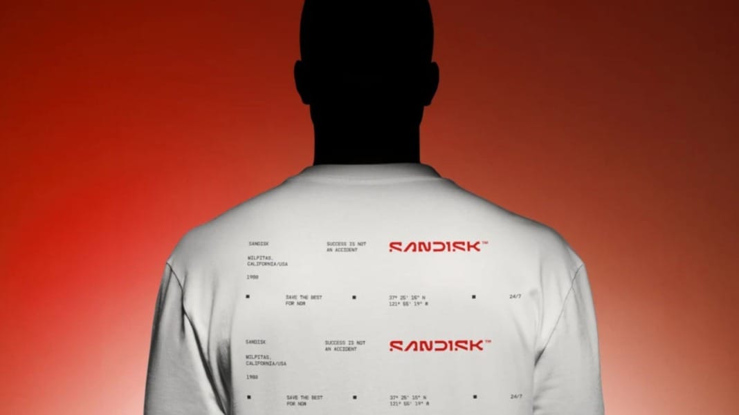
Sandisk has announced a major rebranding, introducing a fresh new logo that symbolises the company’s vision for the future. The rebrand ditches the inter-capped “SanDisk” style used since 1995 in favour of a modern, streamlined look. Now simply “Sandisk” in bold slab serif, the new design is inspired by “a single point of data” or “a pixel.”
A closer look at the redesign
In a promotional video, Sandisk highlights the features of its new logo. The updated design retains the open “D” from the previous version. Still, it pairs it with a “pixel-driven S,” symbolising the collaboration and partnership needed to push boundaries and unlock new possibilities.
The bold slab serif typeface gives the brand a confident appearance, making it a standout choice in an era of increasingly minimalistic corporate logos. The design aligns with Sandisk’s commitment to innovation and data-driven solutions.
This redesign precedes Sandisk’s expected spinoff from its parent company, Western Digital, which is planned for next year. Western Digital acquired Sandisk in 2016, and the move to rebrand comes as the company looks to define its identity and set itself apart in the competitive data storage industry.
Past controversies and future ambitions
The rebrand comes amid lingering controversies for Sandisk. Last year, its portable SanDisk Extreme SSDs faced widespread criticism after reports emerged that the devices were prone to data loss, even wiping user files without warning. Western Digital, Sandisk’s parent company, remained tight-lipped during the uproar, refusing to explain the issue.
Despite this setback, Sandisk remains one of the most recognisable names in data storage, and its rebrand signals a desire to refocus on reliability and innovation.
While some rebrands in recent years—like those from PayPal, Kia, and Jaguar—have drawn mixed reviews, Sandisk’s effort strikes a balance between modernity and its long-standing brand identity. The bold, unfinished aesthetic has been met with positive feedback, proving that strong branding still matters even in a tech-dominated field.
Setting the stage for a new chapter
Sandisk’s revamped identity positions the company for a fresh start as it gears up for its spinoff. The rebranding, centred around bold visuals and symbolic elements, aims to capture attention and convey a message of partnership and progress.
As the tech world evolves, Sandisk appears ready to face the challenges ahead with renewed energy and a sharper focus on what it does best—delivering innovative storage solutions to its customers.


