With the advancement in technology, users want to experience the best technology fast and without exhausting their busy brains. The real challenge for companies today is to create, market, and sustain a website or mobile app in this saturated landscape. Companies also have to ensure that the differentiators are not only regarding what the product has to offer, but also how it delivers a positive user experience.
The content, design, and functionality of the website and mobile app are vital areas that continue to evolve. However, a user interface (UI) is the most critical element that plays a massive role, not only in bringing in high volumes of relevant traffic but also creating stickiness.
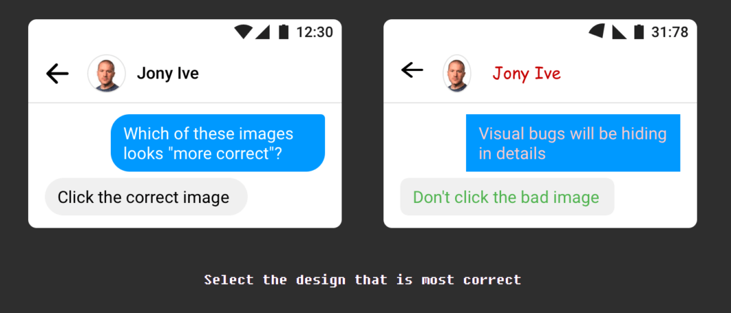
Can’t Unsee, created by software engineer Alex Kotliarskyi, is a web-based game that presents two choices of interface designs, and asks you a simple question which is to select between these two designs. Despite the simple rules, Can’t Unsee proves to be a challenge as you squint your way through three rounds, with 18 pairs of interfaces each to compare, ramping up in difficulty.
Of course, what makes a good UI is subjective, but most of the answers are based on universally accepted design traits even like spacing between text blocks and consistent capitalization.
Are you ready for the challenge?


