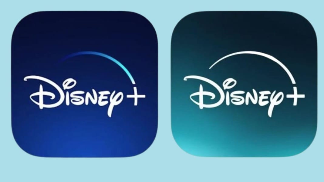
In the constantly evolving landscape of streaming services, Disney Plus has taken a bold step away from the familiar. Gone is the iconic Disney blue, replaced by a striking green hue that has left viewers double-taking. This new shade, aptly named “Aurora”, nods to the natural wonder of the aurora borealis and Sleeping Beauty herself. Though the green of “Aurora” might not recall the classic film’s palette, it represents a significant shift in the Disney Plus brand, merging the identities of Disney and Hulu in a vibrant new way.
A controversial change
The transformation has sparked mixed reactions among Disney enthusiasts and casual viewers alike. While some lament the departure from the classic blue, synonymous with Disney’s enchanting beginnings, others welcome the change as a breath of fresh air in a sea of similar-looking streaming service logos. The new logo’s debut has been met with curiosity, with its initial dark backdrop blossoming into a warm, glowing emblem of Disney’s next chapter. This blend of nostalgia and innovation captures the essence of Disney while standing out in the crowded streaming landscape.
The sound of change
Accompanying the visual refresh is a new mnemonic crafted by Ludwig Göransson, known for his work on The Mandalorian, Black Panther, and Tenet. Göransson’s recent Oscar win for the Oppenheimer score underscores his versatility, something that’s echoed in the new Disney Plus sound. This sonic signature weaves together elements reminiscent of Disney’s “When You Wish Upon a Star”, a touch of Hulu’s crescendo, and perhaps a nod to Pixar’s playful light switch, culminating in a familiar and fresh melody.
More than just a colour change
The rebranding of Disney Plus to include Hulu content signifies more than a mere aesthetic update; it marks a significant operational shift within the company. The integration of Hulu is part of a broader strategy to streamline Disney’s streaming offerings under a single platform, a move that heralds a new era for Disney Plus. This architecture of Disney’s streaming infrastructure is treated internally as a relaunch of the service, complete with extensive advertising campaigns to herald the new, greener Disney Plus.
While the logo change is the most visible sign of this transition, it is just the beginning. The Disney Plus app maintains its original colour scheme for now, but the inclusion of Hulu and, in some regions, Star indicates a more integrated and expansive service offering. As Disney Plus embraces its new identity, it stands out not only for its distinctive colour but also for its ambition to redefine what a streaming service can be.
Disney’s bold move to a greener hue for Disney Plus not only distinguishes it from the competition but also signals a new chapter in its streaming saga, blending Disney’s legacy with today’s innovation.


